Repository navigation
feat(storia): de-cardify the history page and align it with Figma - #200
Draft
viganogabriele wants to merge 1 commit into
Draft
viganogabriele wants to merge 1 commit into
viganogabriele wants to merge 1 commit into
Conversation


- Hero: Figma's centred XL title (fluid) with the two anchor actions; the
  rotated portrait collage and floating "200+" chip are gone (the board
  portraits already appear under "I nostri direttivi").
- "Come è nato tutto": the two 2016/2022 cards that repeated the timeline
  right below are removed; the text stands alone until the archive photo
  Figma reserves exists.
- Timeline: nodes on a line (vertical below lg, horizontal from lg) instead
  of four hoverable glass cards; the year is the link to its chapter.
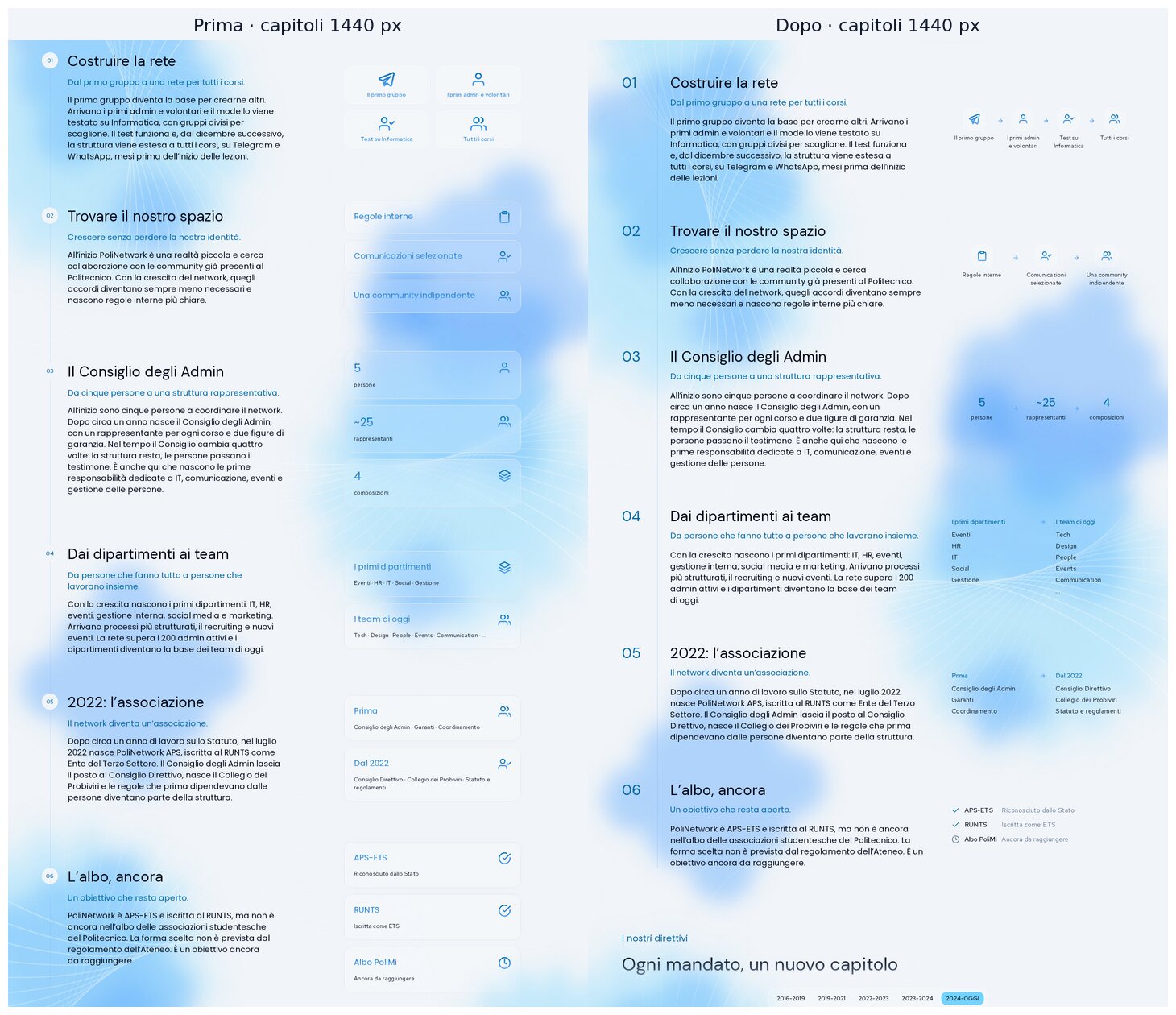
- Chapters: numeral in the margin and one continuous vertical rule across
  all six; diagrams drawn without containers (icon chains, 5 → ~25 → 4,
  before → after columns, status list) instead of stacks of glass cards.
- No hover on things that are not links (board portraits, the closing
  statement); "L'obiettivo è raggiunto" is a statement, not a card.
- Projects note, thanks list, board summary and "La storia continua" lose
  their glass panels; the closing gradient panel and the filled "?" pill
  (which read as a button) become years on a line with an open slot.
- One container for every section (Figma's 1272px column, 24/40/64px
  gutters) and left alignment at every width for this long reading page.

Co-Authored-By: Claude Opus 5.5 <noreply@anthropic.com>

Contributor
|
Important Draft PR not reviewedDraft PRs are not automatically reviewed by default.
To automatically review draft PRs, update your CodeRabbit configuration: reviews:
auto_review:
drafts: true
Thanks for using CodeRabbit! It's free for OSS, and your support helps us grow. If you like it, consider giving us a shout-out. Comment |
This was referenced Oct 27, 2026
This file contains hidden or bidirectional Unicode text that may be interpreted or compiled differently than what appears below. To review, open the file in an editor that reveals hidden Unicode characters.
Learn more about bidirectional Unicode characters
Sign up for free
to join this conversation on GitHub.
Already have an account?
Sign in to comment

Add this suggestion to a batch that can be applied as a single commit.This suggestion is invalid because no changes were made to the code.Suggestions cannot be applied while the pull request is closed.Suggestions cannot be applied while viewing a subset of changes.Only one suggestion per line can be applied in a batch.Add this suggestion to a batch that can be applied as a single commit.Applying suggestions on deleted lines is not supported.You must change the existing code in this line in order to create a valid suggestion.Outdated suggestions cannot be applied.This suggestion has been applied or marked resolved.Suggestions cannot be applied from pending reviews.Suggestions cannot be applied on multi-line comments.Suggestions cannot be applied while the pull request is queued to merge.Suggestion cannot be applied right now. Please check back later.
Second page of the visual refinement, stacked on #199 (it uses the fluid display utilities added there). Figma:
5368:5885.The page is an archive, so its length is fine. The problem was that every element had the same visual weight: timeline, chapters, diagrams, closing statements and panels were all glass cards. The six chapters lost the structure that makes a long sequence readable. This PR restores Figma's editorial structure and removes containers and hover where nothing is clickable.
What changes
Hero
typo-display-fluid-extralarge) with the gradient subtitle and the two anchor actions.Come è nato tutto
Timeline 2016 → oggi
lg, horizontal fromlgas in Figma.Chapters 01–06, the biggest change (see the close-up below)
display-small, blue-secondary).5 → ~25 → 4(03);Other sections
Layout
max-w-350with 24/40/64 px gutters, which is Figma's 1272 px column at 1728.max-w-700/px-4wrapper and the per-sectionmax-w-330 px-6are gone.Shared changes and their reach
None. Every change is in
src/app/storiaandsrc/components/storia.ui/herois reused as is, with a className override.TextOnlyLayoutis only configured throughclassNames.CONTAINERaddsmd:px-10to neutralise itsmd:px-36default.Screenshots
Chapters, 1440 px
Desktop 1440 (full page)
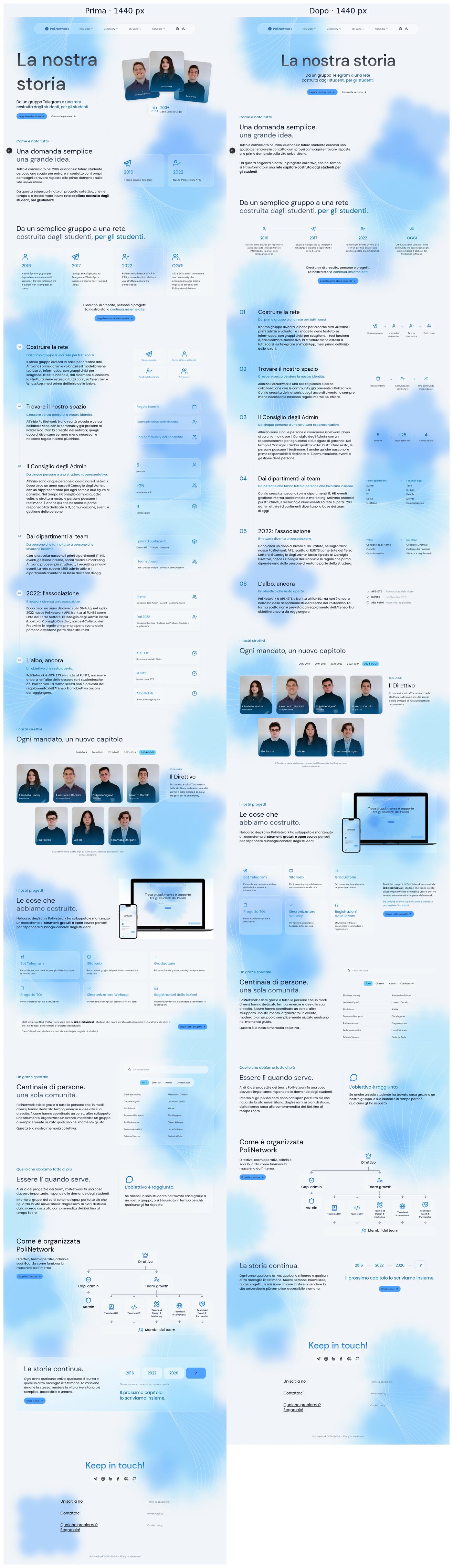
Tablet 1024

Mobile 390

Verification
pnpm check: clean.pnpm build: passes.pnpm typecheck: clean.node --test tests/*.test.mjs: 2/2 pass.Trade-offs
xl. This holds until a photo is provided. I preferred that to filling the space with duplicated content.lg.Deliberately left out
/about; unifying the two charts in one component belongs in the Struttura PR.Housekeeping
The screenshots live on
pr-assets/storia-visual-refinement, which can be deleted after review. This PR is stacked on #199: merge that one first, and GitHub retargets this PR tomain.🤖 Generated with Claude Code