Repository navigation
feat(associations): honest logo fallback and a steadier accordion - #210
Open
viganogabriele wants to merge 1 commit into
Open
viganogabriele wants to merge 1 commit into
viganogabriele wants to merge 1 commit into
Conversation


- Associations without a logo show their initials instead of ESN's logo,
  which came from the Figma example; the unused placeholder asset is gone.
- Page on the shared container, hero and rhythm; the list keeps Figma's
  1200px column.
- Accordion: constant padding open or closed (the name no longer jumps),
  description aligned with the name from md and capped at a readable
  measure, names at 20/22/28px instead of 22/45px, smaller logos on phones.
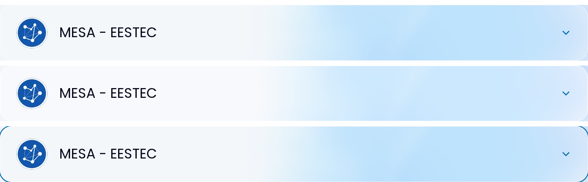
- The clickable header brightens on hover and rings the item on keyboard
  focus; social links get accessible names, 40px targets and rel=noopener;
  "Segui l'associazione" drops its blue gradient and only shows with links.
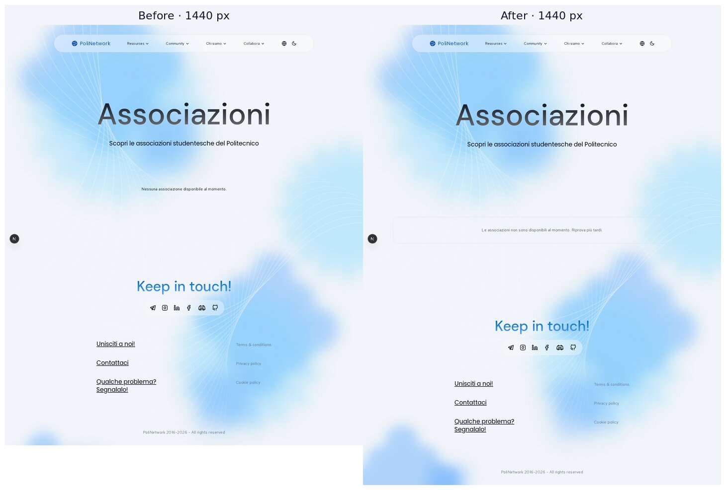
- Empty or unreachable list: a dashed placeholder like /projects.
- Shared Hero: the title size is capped so its longest word fits the
  content width; "Associazioni" and "Contattaci" overflowed phones and
  tablets. Titles that already fit keep the Figma sizes.
- /about association bodies keep their look on the new accordion padding.

Co-Authored-By: Claude Opus 5.5 <noreply@anthropic.com>

Contributor
|
Important Review skippedAuto reviews are disabled on base/target branches other than the default branch. Please check the settings in the CodeRabbit UI or the
 |
This was referenced Oct 28, 2026

viganogabriele
marked this pull request as ready for review
October 31, 2026 17:54
This file contains hidden or bidirectional Unicode text that may be interpreted or compiled differently than what appears below. To review, open the file in an editor that reveals hidden Unicode characters.
Learn more about bidirectional Unicode characters
Sign up for free
to join this conversation on GitHub.
Already have an account?
Sign in to comment

Add this suggestion to a batch that can be applied as a single commit.This suggestion is invalid because no changes were made to the code.Suggestions cannot be applied while the pull request is closed.Suggestions cannot be applied while viewing a subset of changes.Only one suggestion per line can be applied in a batch.Add this suggestion to a batch that can be applied as a single commit.Applying suggestions on deleted lines is not supported.You must change the existing code in this line in order to create a valid suggestion.Outdated suggestions cannot be applied.This suggestion has been applied or marked resolved.Suggestions cannot be applied from pending reviews.Suggestions cannot be applied on multi-line comments.Suggestions cannot be applied while the pull request is queued to merge.Suggestion cannot be applied right now. Please check back later.
Part of the stacked visual-refinement series. Base is #209 (
/matricole); merge after it. This PR covers/associations(Figma desktop2306:5313, mobile3498:2836) and one shared fix toHero.What changes
Logos are honest
associations-list.tsxfell back to the logo from the Figma example (audit R10).public/logos/esn.svgis removed.alt="") because the name is right next to them.Accordion
md, all Poppins. Before it was 22 px, then 45 px frommd; at 768 px the longer names wrapped onto three lines.mdit lines up with the name;max-w-3xl);rel="noopener noreferrer"and a focus ring.outline-noneand no visible focus at all.Page
layout/page.ts, and the list keeps Figma's 1200 px column.[]for both), the page shows a dashed placeholder with the same style as/projects. Before it was a line of small text in a large empty area.Shared:
Herotitle fits its longest wordmin(Figma size, (100vw − gutters) / (letters × 0.55em)).Shared changes and their reach
ui/hero.tsx: title capped to fit its longest wordHero, only at widths where a long word would overflow (table above). Page heights at 320/390/768/1440 are identical on/collabora,/matricole,/team,/join,/projects,/about,/faqsand/guides;/contactat 320 is +2 px.accordion-association/*: padding, typography, hover/focus/about"Organi associativi" on phones.association-bodies.tsxnow passes its padding and title size explicitly, so it renders as before (screenshot below, heights identical).Screenshots
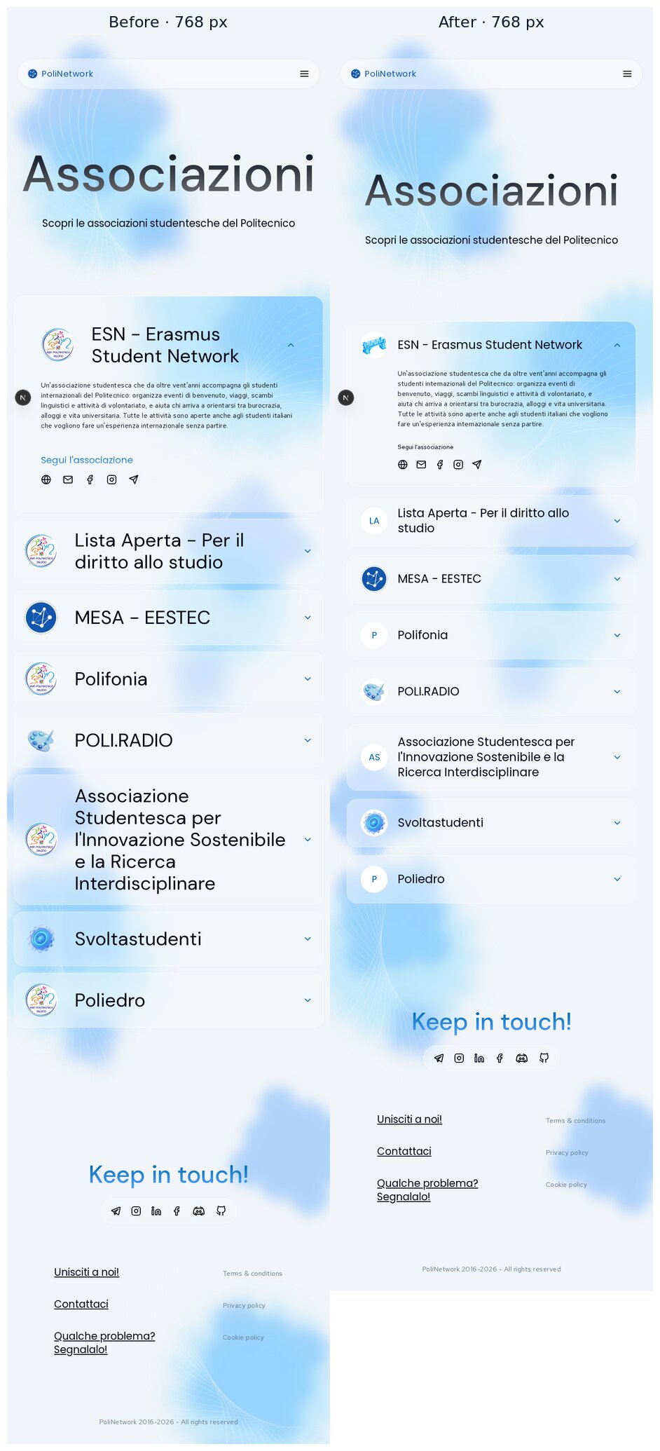
Locally the backend is unreachable, so the "before" and "after" lists come from the same temporary fixture: 8 associations with and without logos, a very long name, a long description, and one item without links. The fixture was not committed. The one difference: the first item's "before" logo is the removed
esn.svg.Desktop 1440
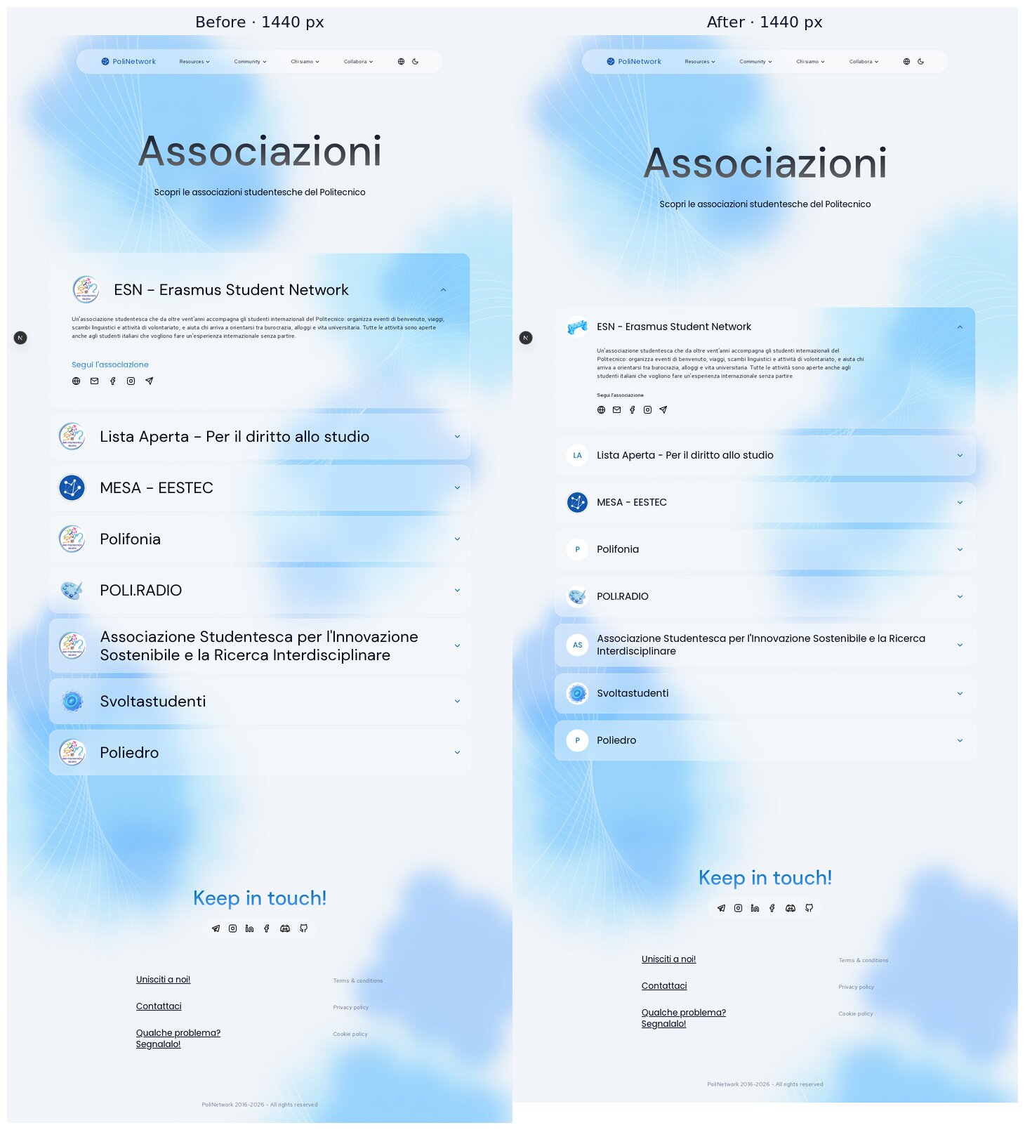
Tablet 768
Mobile 390 and 320
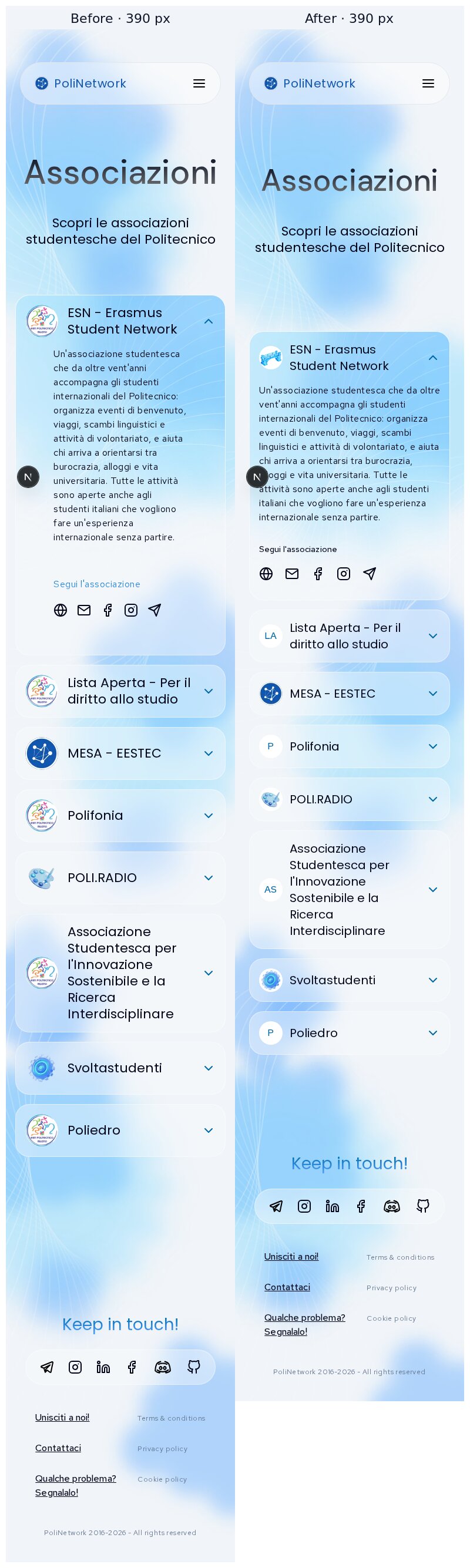
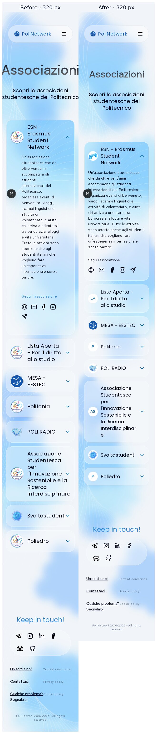
Empty / unreachable list (1440)
Idle → hover → keyboard focus
/aboutassociation bodies on mobile, before | after (unchanged)Verification
pnpm check: clean.pnpm build: passes.pnpm typecheck: clean.node --test tests/*.test.mjs: 3/3 pass./associationswas checked at 320, 390, 768, 1024, 1279, 1280, 1440, 1728 and 1920 px, with no horizontal overflow.Trade-offs
overflow-wrap: break-word) rather than run under the chevron. With the fixture this never triggers at 320 px.Deliberately left out
descriptionEn) waits on the language switch, which is an open decision.Housekeeping
The screenshots live on
pr-assets/associations-visual-refinementso the diff stays code-only; delete that branch after review.🤖 Generated with Claude Code