Repository navigation
feat(groups): fix the results layout and give every link a hover state - #208
Open
viganogabriele wants to merge 1 commit into
Open
viganogabriele wants to merge 1 commit into
viganogabriele wants to merge 1 commit into
Conversation


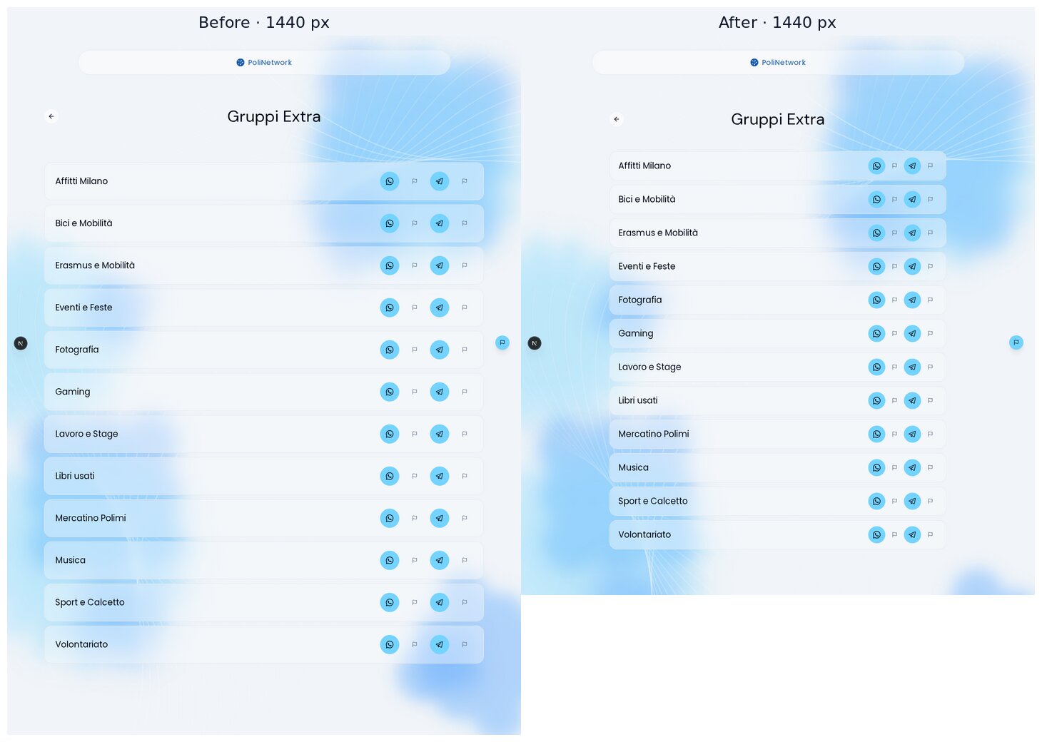
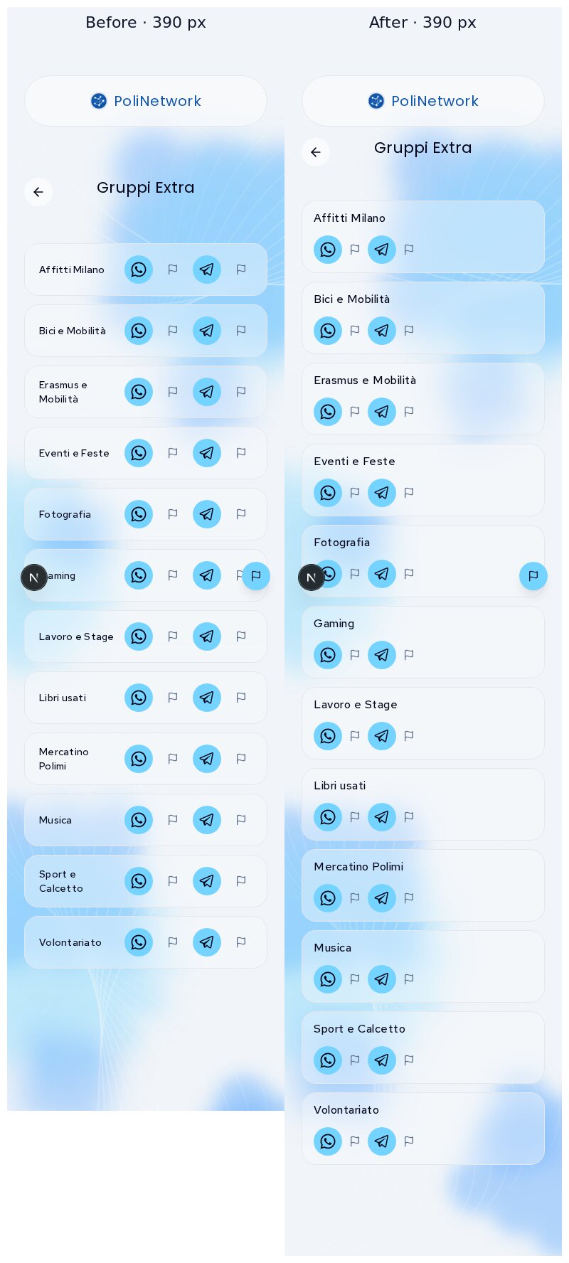
- Results and extra pages: one ~1024px column (Figma's list width) with a
  shared header component (back, centred title, close) laid out on a
  three-column grid, so long course names no longer run under the buttons
  on phones.
- The general groups (site, school, level, course) were squeezed four per
  row with their names overlapping the platform buttons; they now sit one
  per row, two per row from lg, as in Figma.
- Group rows: name and buttons share a row; when the card is narrower than
  20rem the name gets its own line instead of breaking word by word. The
  `stacked` variant is gone.
- Hover only where there is a link: the platform buttons darken, the report
  flags darken, course rows lighten and nudge their chevron, the landing
  cards get the identity hover. Keyboard focus rings on all of them.
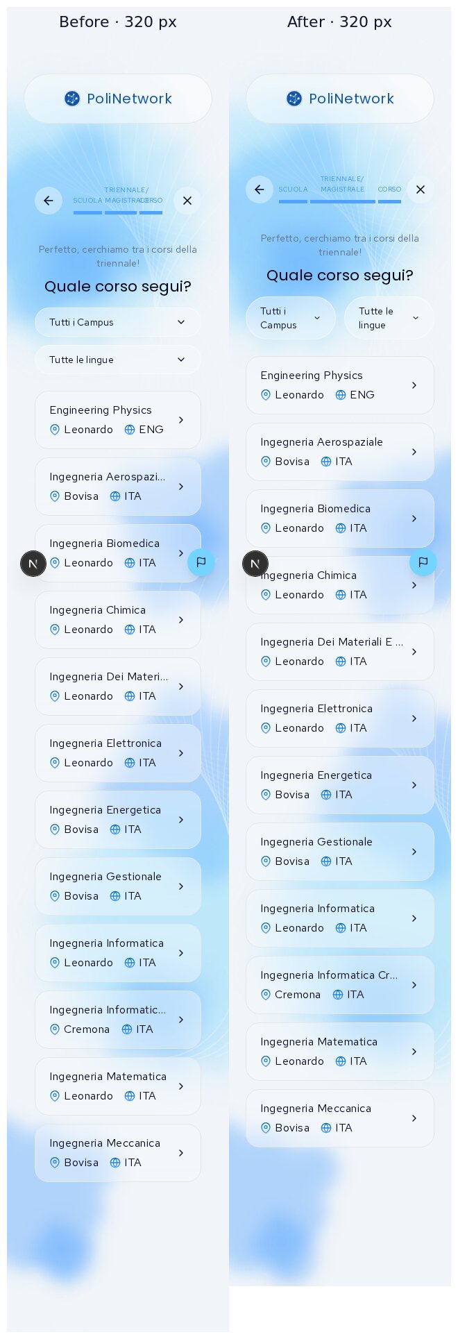
- Wizard: no wasted 16px inset on phones, where the glass panel is
  invisible, so the step labels fit at 320px.
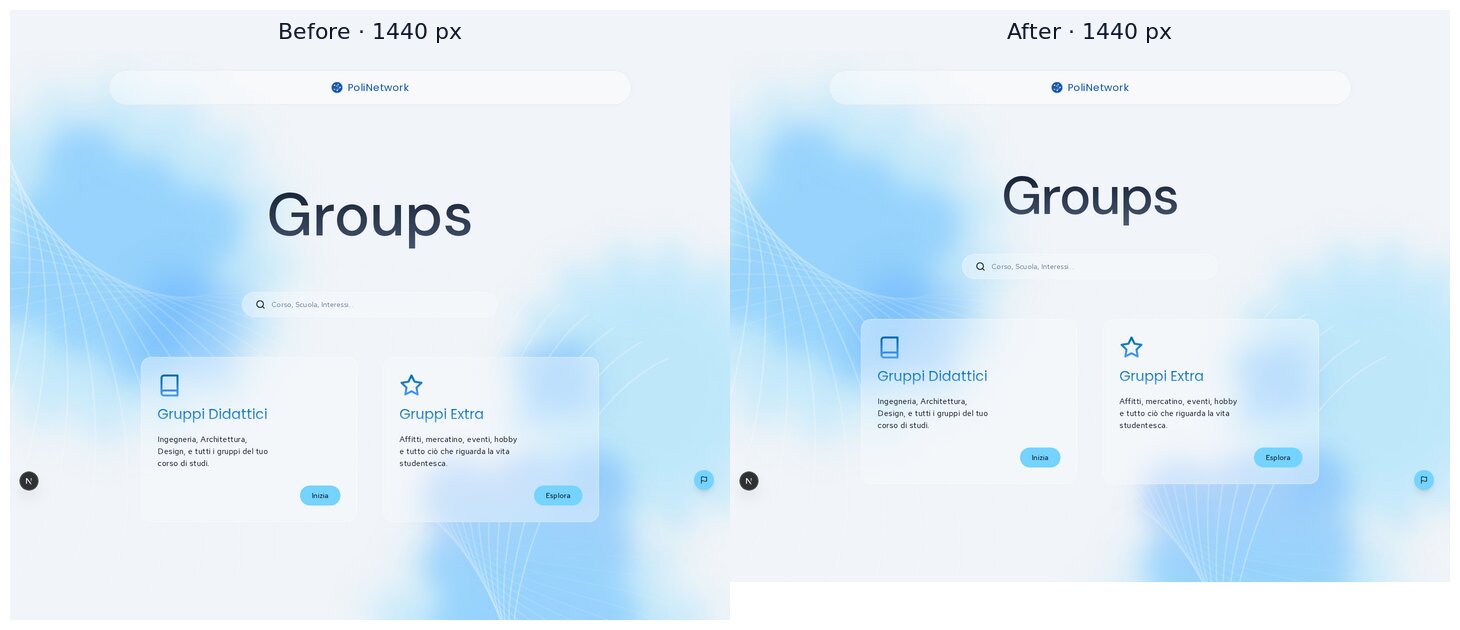
- Landing title uses the fluid display size and is the page's h1.

Co-Authored-By: Claude Opus 5.5 <noreply@anthropic.com>

Contributor
|
Important Review skippedAuto reviews are disabled on base/target branches other than the default branch. Please check the settings in the CodeRabbit UI or the
 |

viganogabriele
marked this pull request as ready for review
October 31, 2026 17:54
This file contains hidden or bidirectional Unicode text that may be interpreted or compiled differently than what appears below. To review, open the file in an editor that reveals hidden Unicode characters.
Learn more about bidirectional Unicode characters
Sign up for free
to join this conversation on GitHub.
Already have an account?
Sign in to comment

Add this suggestion to a batch that can be applied as a single commit.This suggestion is invalid because no changes were made to the code.Suggestions cannot be applied while the pull request is closed.Suggestions cannot be applied while viewing a subset of changes.Only one suggestion per line can be applied in a batch.Add this suggestion to a batch that can be applied as a single commit.Applying suggestions on deleted lines is not supported.You must change the existing code in this line in order to create a valid suggestion.Outdated suggestions cannot be applied.This suggestion has been applied or marked resolved.Suggestions cannot be applied from pending reviews.Suggestions cannot be applied on multi-line comments.Suggestions cannot be applied while the pull request is queued to merge.Suggestion cannot be applied right now. Please check back later.
Stacked on #207 (
feat/projects-visual-refinement) → … → #199. Part of the page-by-page visual refinement. Figma: landing2782:5643, wizard3071:6242, results3082:8078.What changes
Results page (
/groups/didattica/<school>/<level>/<course>)flex-wraprow.lg, as in Figma (2 cards side by side).max-w-7xl(1280) to ~1024 px, Figma's list width (~1040 at 1728). Rows of short group names no longer stretch across the screen.GroupsPageHeaderlays out back, centred title and close on a 3-column grid.h2row with consistent spacing. The magic margins (md:mt-16.25,md:mt-25.75…) are gone.Group rows (
CardCourseGroup, used only on these two pages)text-balance(no orphan "1" in "Analisi Matematica 1") andwrap-break-wordas a safety net. Thestackedvariant is removed.text-primary, and both have a focus ring.Hover = clickable (R9)
CardCourse, always rendered inside a link or button) lighten and nudge their chevron.Wizard
md, but it kept a 16 px padding. Removing it, plus tighter gaps, lets the step labels fit at 320 px. Before, "TRIENNALE/MAGISTRALE" overflowed into "CORSO".Landing
h1(it was anh2with noh1on the page).Shared changes and their reach
WizardShell: no inner padding belowmd, tighter header gaps on phones/guides/corso/**(same wizard): checked at 390/1024/1440, same improvementCardCourse: hover stateCardCourseGroup: layout,stackedprop removed/groups/**Screenshots
The backend isn't reachable locally, so before and after both use the same temporary local fixture: 60 fake groups, site/school/level/course groups, two cohorts, 12 extra groups. The fixture was never committed.
Results page: 1440, 768, 390, 320
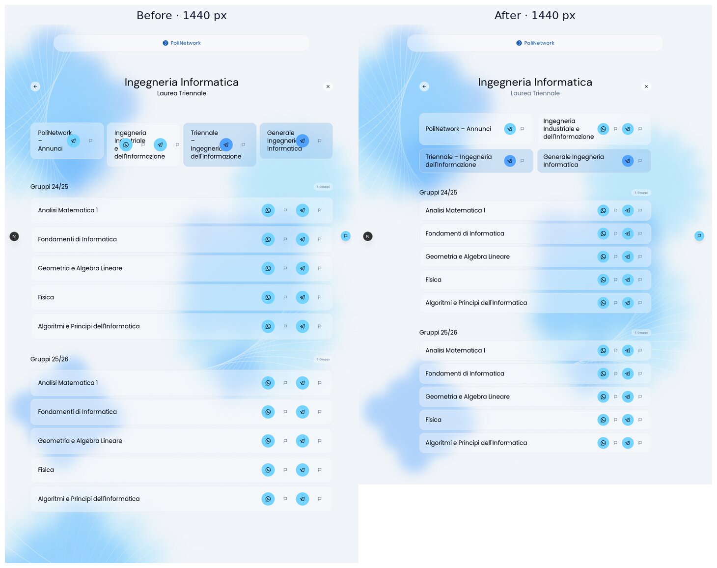
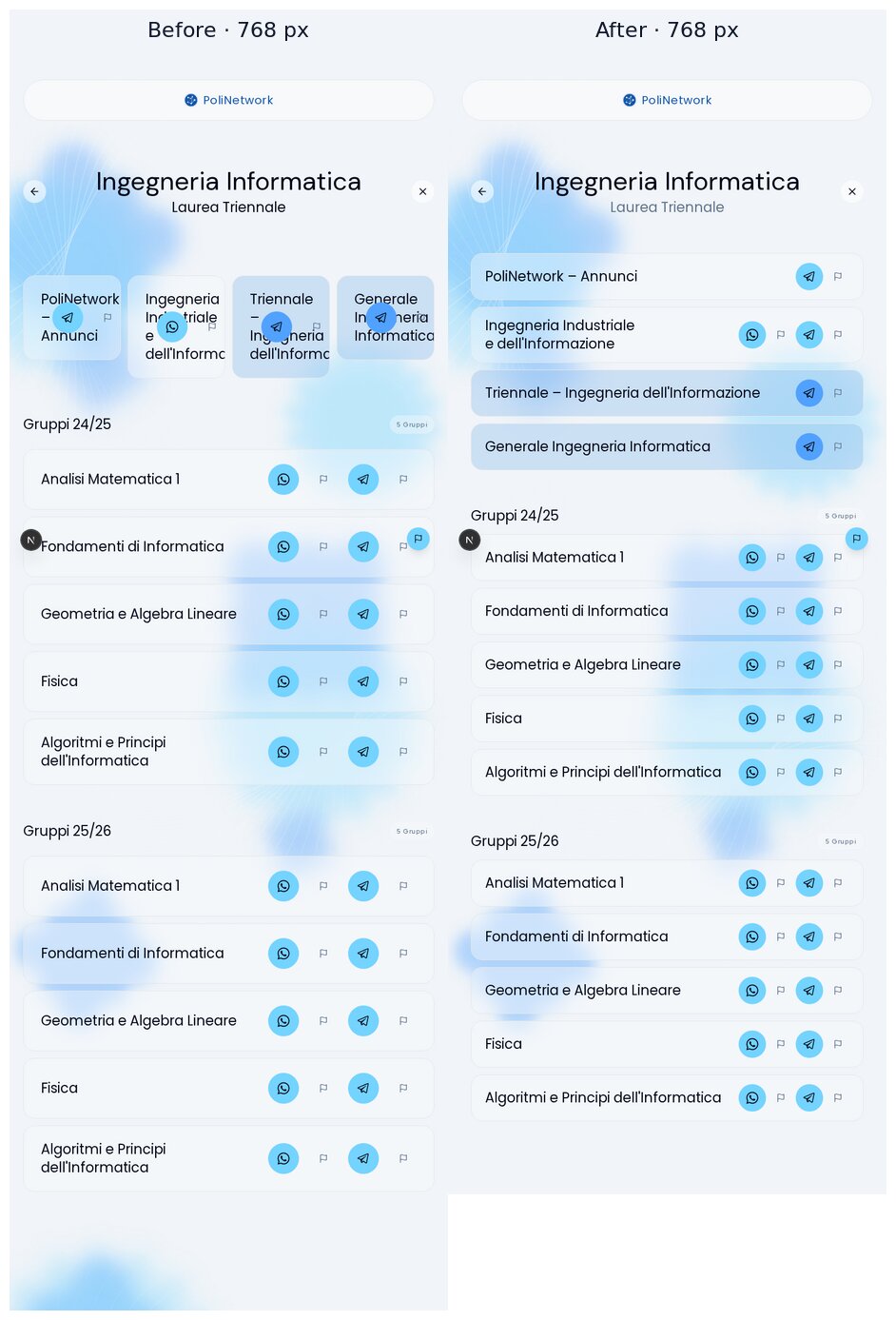
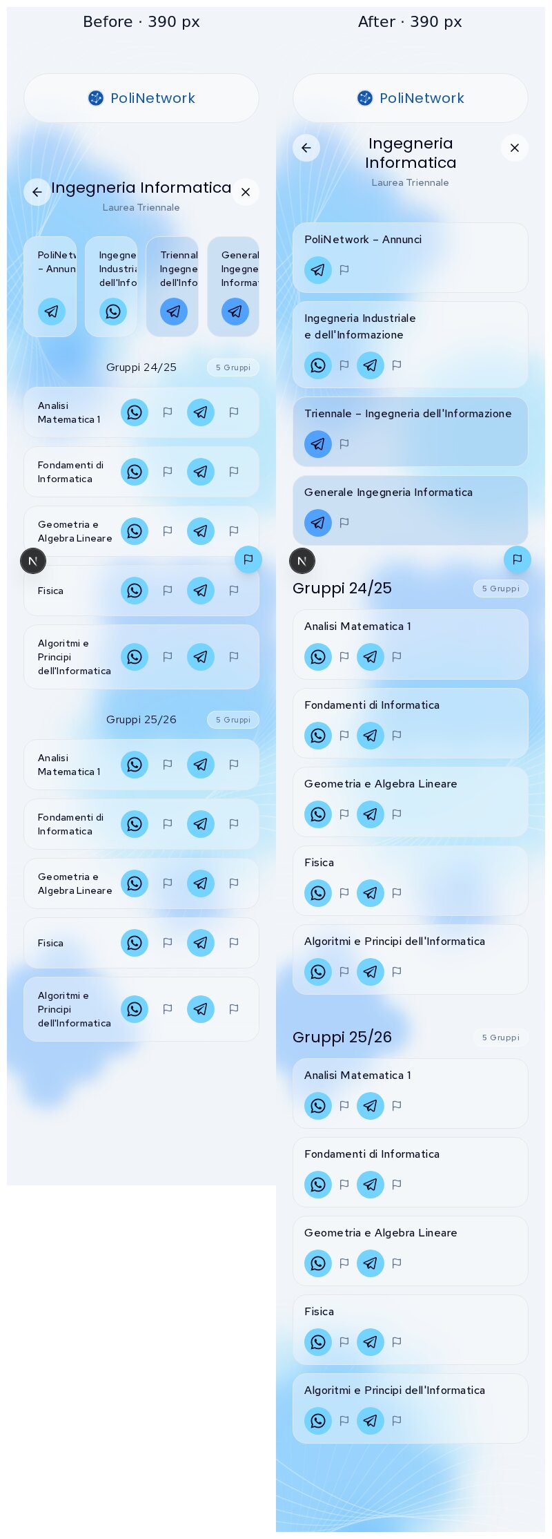
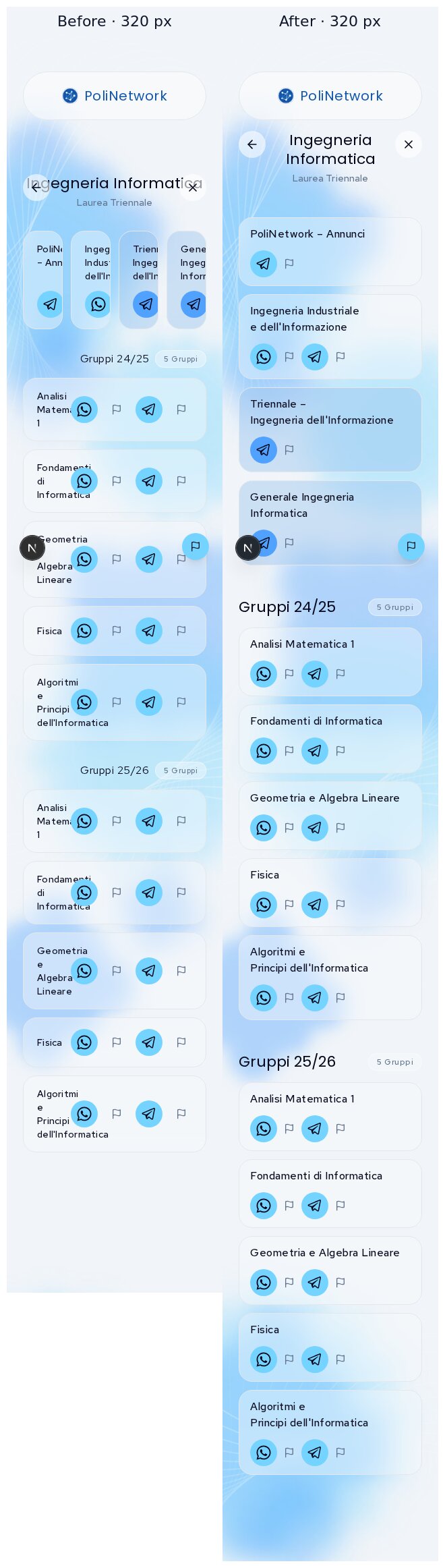
Extra groups: 1440, 390
Wizard course step at 320 (step labels)
Landing, 1440
Hover: idle → hover (landing card, course row, Telegram button)

Verification
pnpm checkis clean,pnpm buildpasses andpnpm typecheckexits 0.node --test tests/*.test.mjs: 2/2 pass./groups/groups/didattica, plus its school, level and course steps/groups/extra/guides/corsoand its school stepTrade-offs
Deliberately left out
/groups. Figma shows the full navbar, but feat: connect groups to backend #155 reduced it on purpose: the logo links tohttps://polinetwork.organd the footer is hidden too./groupsis meant to run standalone in front of the current site, where the beta navigation would lead to unfinished pages. That is a product/deploy decision, not an implementation slip, so I left it.CardIconbuilds responsive size classes at runtime ("md:" + token), so Tailwind never generates them:size={{ base: "sm", md: "md" }}silently loses themdsize. That is aCardIconbug worth its own fix. Until then the school tiles keep their single size.Housekeeping
The screenshots live on the
pr-assets/groups-visual-refinementbranch, so this PR's diff stays code-only. Delete the branch after review.🤖 Generated with Claude Code